5 Things to Consider When Designing Your Coffee Packaging
No roaster should overlook the importance of their retail coffee bag design. The right packaging can convey your brand, help you to stand out on shops shelves and social media, ensure consumers recognise you, and more.
So if you’re looking to update your coffee bags or boxes, I’ve spoken to five companies that are leading the way in creative, brand-boosting design. Read on to discover what factors went into their choices.
Modern vs Traditional: Stumptown
Portland’s Stumptown Coffee Roasters recently launched their new packaging. Gone are the brown bags with the cards in the sleeve. Instead, in come earthy colours.
“A lot of folks started using the brown bag,” says Mallory Pilcher, Marketing Events Director. “The time for change had come and we wanted to take our look to the next level.”
The company worked with a design agency and left the colour palette on blends entirely up to them. “As for the single origins, we wanted to continue the legacy of the colours we’ve used on bag cards for the regions we source coffee from, in a subtle fashion,” Pilcher explains.
Stumptown have also kept it simple when it comes to tasting notes, with just two listed on the bags.
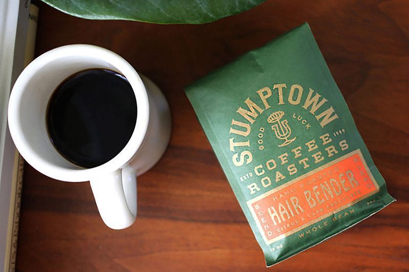
“We’ve found tasting notes can get really convoluted, lengthy and tough to decipher for the average coffee drinker,” says Pilcher. “Most coffees have two dominant tasting notes, and if our customers would like to go further down the rabbit hole, we would rather they engage with
us on a digital space to learn more about our coffees.”
Their new packaging has become more environmentally friendly as well, with the useof Biotre compostable bags. “Biotre bags are the cutting edge of coffee bag technology. We’re stoked to showcase our coffees in this vessel,” notes Pilcher.
Environmental Concerns: La Colombe
Stumptown Coffee Roasters are not the only ones with environmental concerns. New York’s La Colombe Coffee Roasters uses compostable packaging with the goal of minimising their environmental footprint. “Packaging should be raw, recyclable, and natural,” says Marketing Manager Alicia Gentile.
Just over a year ago, the brand launched their clear, airtight bag of coffee beans, carried in a structured paper box. Each box features art that connects the coffee drinker to the coffee’s origin.
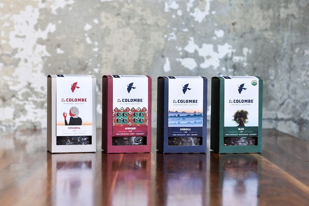
“With this packaging, we’re increasing transparency while decreasing environmental impact, cutting our use of plastic and non-renewable fossil fuels nearly in half,” Gentile tells me. “The outer box is fully recyclable and the plastic bag is made from a mix of plastic, wood pulp, and a starch additive that promotes biodegradation.”
Incredibly, nearly all of the packaging will be completely reabsorbed into the natural cycle in five to ten years.
Eye-Catching Colours: Terbodore
Michael Macaskill, Co-owner of Terbodore Coffee Roasters, knows the importance of good packaging. “This is what the customer grabs and takes home. It’s a decision that’s often based purely on look and feel,” he says.
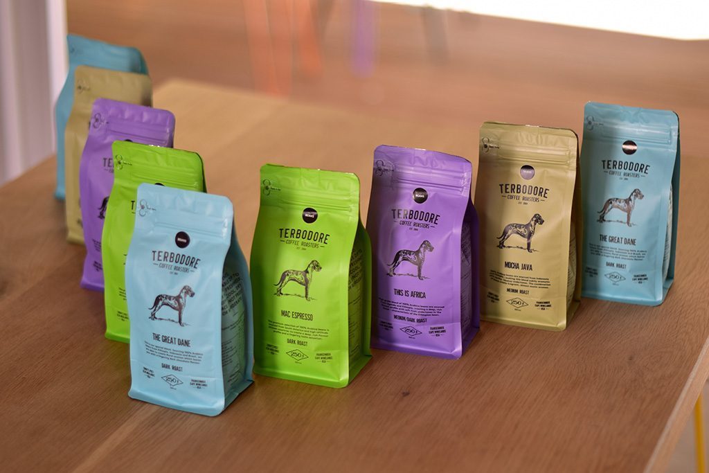
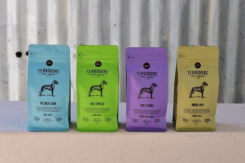
One of South Africa’s leading specialty coffee brands, the brand launched their new bags earlier this year. Each coffee is represented by a bold colour, and the design has evolved from black bags with coloured stickers to coloured bags with black detailing. “These colours really make a statement and jump out at you, especially when shared on social media,” explains Macaskill.
The bags also feature zip pull technology, an opening mechanism that Macaskill tells me is a South African first. “It allows coffee lovers to keep their coffee fresh and sealed in the bag without having to decant the coffee,” he says.
Unique Style: Barista Parlor
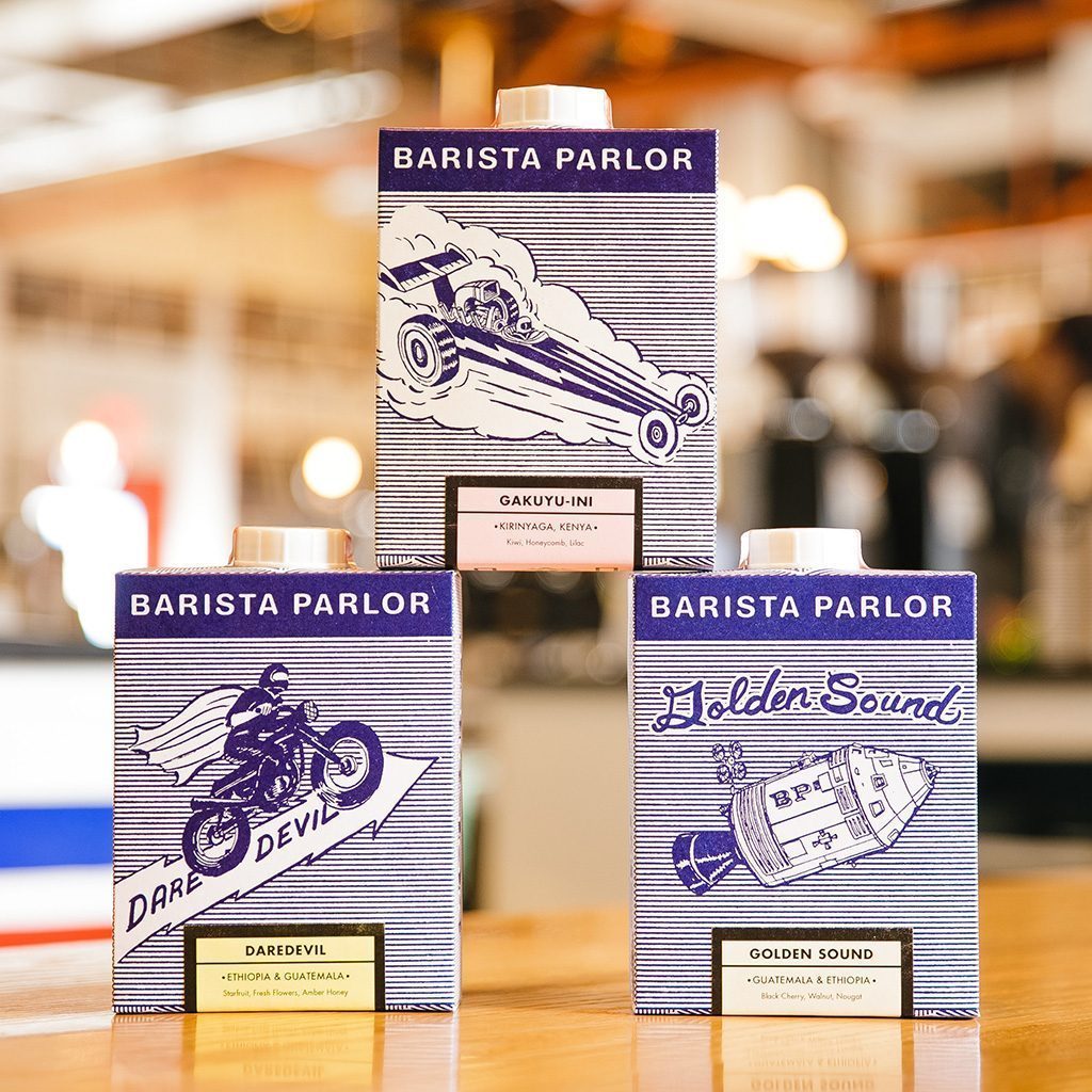
Nashville’s Barista Parlor goes against the norm, in terms of both package design and artwork. “We present the coffee box as a functional piece of letter-pressed art,” says Chris Ayers, Managing Director.
Each box, which looks similar to a milk carton, is lined with a valved inner bag with a sealed pull tab on top for freshness. Blue and white dominates and the artwork includes drawings of a sailing ship, Concorde, top fuel dragster, old racing car, stunt bike, and Apollo space capsule.
Unique designs aren’t always easy to create, but Ayers believes they are worth the effort. “They are designed and printed right here in Nashville. When we started roasting our own coffee it was important to us to do things without resorting to conventional norms just because it was easier.”
Brand Consistency: Drop Coffee
Joanna Alm, Managing Director of Sweden’s Drop Coffee Roasters, has a similar opinion. “In the world of social media, coffee packaging is ‘Instagrammable’. Many recognise and remember not only the product but also the company, through the packaging,” she tells me.
And the perfect packaging?
“You want it to be functional, pretty and mirror what the product is all about,” Alm explains.
But when Drop Coffee designed their latest packaging, they took a wide range of factors into consideration – including brand consistency.
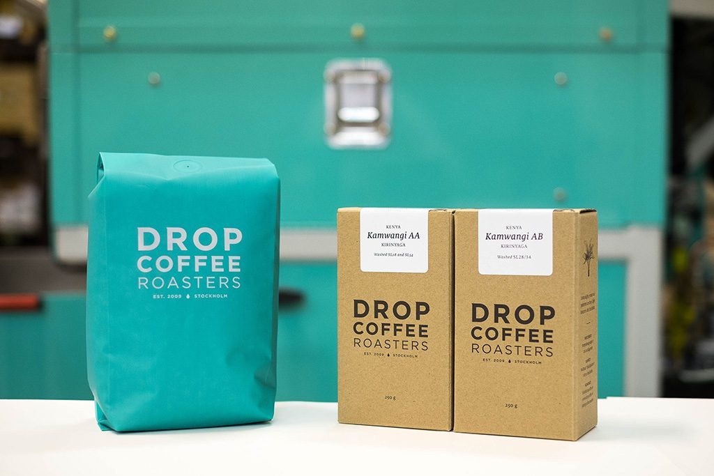
A few years ago, they changed to a matt but light turquoise. “We had ordered a Diedrich 25 roaster and had the opportunity to brand it by colour,” says Alm. “From that, the turquoise became our brand colour. In the packaging, this is the little colour kick ‘surprise’ you’re getting inside the cardboard box.”
Drop changed to this box design at the same time. “We wanted something that was able to stack and stood steady. It still looks neat after a customer picks it up and places it back. In Scandinavia, most specialty coffees in the supermarkets are square shaped bags, but none come in a box. The box had not been done before and it made it stand out in that market,” she explains.
Drop ensures freshness with a plastic recyclable bag inside with a valve. The coffee is sealed directly after roasting.
In many ways, what the coffee comes in is as important as what is inside. The design of the bag or box is what catches the customer’s eye first. It provides an opportunity for roasters to communicate directly with the consumer. And as my interviewees demonstrate, there are ample opportunities for roasters to innovate, experiment, and be creative.
Written by Hugh Pines. Originally published on perfectdailygrind.com
